Design is-70%dealing with people, 3% the idea, 3% eye for detail, 3% teabreak, 5% brain storming, 3% knowing when to stop, 2% warm glow, 2% colour
Design is...
“Collecting things stimulates
the brain. It helps you think
of something fresher.”
Wieden & Kennedy
Brief
As part of this brief you have been given a word that has been considered to be a vital element of design.
You are required to bring in an item you feel represents your word best. It should be no larger than a brick and no smaller than a matchbox.
We would like to encourage you to be adventurous
and explore your imagination and the environment.
- DON’T GO FOR THE OBVIOUS -
Your word is ............................
Deadline: 30/09/09
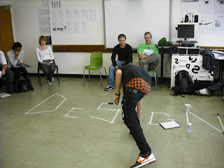
For our part we need to make 32 place cards that refers to the word or words that we have handed out. In the next part of the exercise the students will sit in a circle of chairs each with a place card with their word on it. They will read out what is written on the back of the card whilst holding up their object. Then they will be required to put their object into the outline of the word design that will be outlined on the floor in front of them,. Then the exercise will becomplete when the word design is spelt out using the objects that we have selected for the brief.
Here are some examples of our place card design


No comments:
Post a Comment