1 week full font with A3 specimen sheet.

I have used this typeface as my example
as i felt that i progressed it to a finished
uppercase alphabet A-Z without many initial
problems it fell together easily.
My original typeface i called Capricious and
using negative and positive space to produce it
i think it has potential to become a good typeface.
I intend on working on Capricious further.
Research
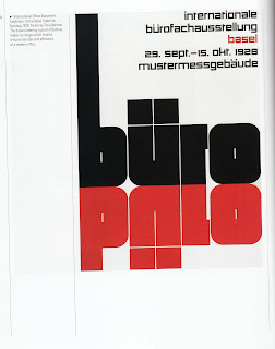
I studied mainly the work of the Swiss Graphic Designers of
the 1920-60 period and i was drawn to the typographic style of
Alfred Williman. I did try and aesthetically create an unconventional
shape that is common throughout the A-Z.
I have included some examples of the work that has influenced what i have created.

The work of Alfred Williman
particulary influenced me.

This poster by Theo Baller i found impressive. I also created another typeface that i named Capricious, i based my typeface Beist on it although i originally based Capricious on the use of positive and negative space.

Capricious typeface.

More examples can be seen in
my research of typographers
that have inspired my fonts.

No comments:
Post a Comment