Thursday, 26 November 2009

What will happen to the underground map?

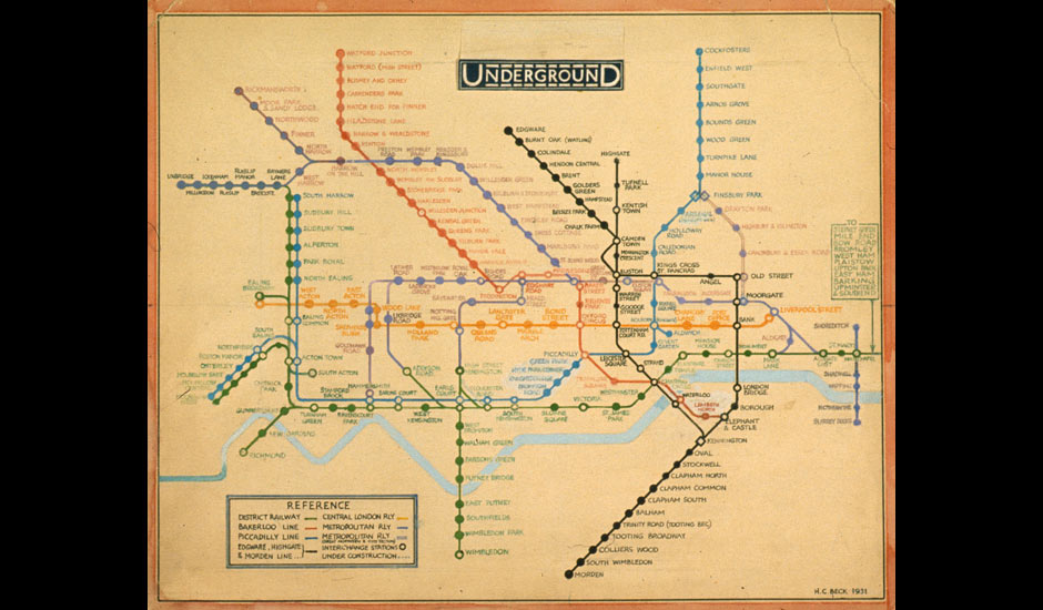
Original drawing for the diagrammatic London tube map by Henry Beck (1931)
View larger picture

A thing of clarity and beauty ... detail from Harry Beck's 1931 tube map

Might the Oyster card swipe the world-famous London Underground map off the walls of tube stations for ever? From the beginning of 2010, Oyster cards can be used for travel on all public transport services in Greater London including tube trains, buses, trams, suburban trains, the Docklands Light Railway and Thames Clipper river boats. What this revolution in ticketing means is that Londoners and visitors to the capital will be able to travel seamlessly above, below and across the city, as well as out to its farthest-flung suburbs.

Only sensible, but what of the tube map? Designed by Harry Beck, an engineering draftsman with the London Underground's Signals Office, in 1931, this colourful diagram has been part and parcel of London life, whether folded in jacket pockets or pasted across station walls, since it was first published in 1933. Beck himself continued to revise his map until 1960; since then a number of other hands, amateur and professional, have continued to tinker with it.

But, because an Oyster-generation map will need to show all the routes available to card users, the design has become too limited in its scope. Mapmakers have had their work cut out trying to fit all the information into a legible sheet of paper. For years, there have been maps on platform walls of the Overground mixed up with the Underground, yet these are scrappy – even ugly – things in comparison with the classic tube-only map. And although there's no official Oyster map as yet, the current Overground-Underground maps give some clue: it's messy. These maps are hard to look at, especially because they are crudely divided into fare zones marked by grim graphic borders. It looks like an enormous plate of spaghetti dropped on the floor. The interactive map you can find on Transport for London's website is even clumsier.

Terry Farrell's new book, Shaping London, narrates the many different ways that London has been mapped over the years – even including an example of the capital's canal system mocked up to look like Beck's design. This is fun (even rather useful), but also highlights the inevitable tension in mapmaking between the desire to cram in more and more information and the need to keep things clear. Although it's true that maps can be detailed while also being items of lyrical beauty, even those of us who covet our Ordnance Surveys can't pretend that they would be much use for someone trying to make a decision about how to get from Sudbury Town to Catford at the peak of rush hour. Equally, although I've looked far and wide, I haven't found a map from another city anywhere in the world that has yet managed to cram so much choice and information into a single, memorable and easily understood flat image. If you have, please let me (and Transport for London) know.

What the project surely needs is another Harry Beck, someone who can make clear graphic sense of so many routes and different modes of transport. Designing a London Oyster map would make a fine project for schools, design colleges and professional designers. Perhaps the Mayor of London and Transport for London should run a competition and see what they come up with.

What would Beck himself have done? A man of vision as well as courage – and a pragmatist if ever there were one – he might well have recommended something drastic, even iconoclastic: tearing up his own Underground map, and suggesting that we begin again from first principles. No doubt this would be an occasion as emotionally charged as the introduction of decimal currency was nearly 40 years ago, but it might be the only rational thing to do. The walls of Underground and Overground stations from Clock House to Cockfosters, Pontoon Dock to Pinner, wait with the impatience of a regular commuter.

Gaurdian, culture 26/11/09

Underground Maps Various Designs through the years


London Underground Maps: London Underground Maps

Tuesday, 24 November 2009

water

Design Literacy summary

Design Literacy: Understanding Graphic Design. By Steven Heller.


Steven Heller, (born 1950), American art director, journalist, critic, author, and editor who specializes on topics related to graphic design. This article appeared in his book Design Literacy: Understanding Graphic Design and the intended audience is graphic design students, practitioners and subversive activist groups.

Heller deals with themes like racism, race riots and how television can misconstrue racism to a voyeuristic public.

He highlights the work of New York graphic designer, James Victore and his contribution towards contemporary visual iconography. The most memorable being what he called the Dead Indian and Racism both posters using irony to reflect social misunderstanding of racism and American history in his opinion.

Heller outlines various antiestablishment campaigns that Victore has been associated with through his career and links them to a postmodern theoretical dialect.

The article then moves on to,The Education of a Graphic Designer. by Steven Heller; Searching for a Black Aesthetic in American Graphic Design by Sylvia Harris.

This part of the article is designed to inform the reader of an African American Aesthetic and Sylvia Harris gives an account of her experience as an African American student within the design community. Her style is subjective and she seeks to link performance with self-esteem, indicating that she believes self confidence may be the single most important influence in the lives of African Americans.

To underpin this theory Harris uses as an example the spectacular success of black musicians and the relationship between confidence,

leadership and success. Harris asks whether there maybe a potential design influence that can fuel black designers in a similar way.

She also warns against (through discussion with educators) focusing too much on blackness and so inviting discrimination.

Harris then quotes excerpts from her ongoing search for black influences in American design. Heller uses exstracts from A History of Graphic design by Philip Meggs to link The New Negro movement with Cubisism and Futurist poetry in the 1920’s. The expression of jazz and its motifs being influencial. Ironically he notes the influence of African art on Cubism. In conclusion Heller notes the continuing of black visual traditions through for instance new black media and YSB which continue to give graphic form to contemporary black culture.

By Anthony Wheeldon


Word count: 379

Thursday, 19 November 2009

Critical Text Essay Summary

Summary of article: English Language.

By Samantha Lawrie Auburn University

Samantha Lawrie is Associate Professor of Graphic Design at Auburn University. Her article English language appeared in Art, Design and Communication in Higher Education Volume 6 Number 3, and this was

the intended audience.

This article informs the reader of her understanding of the

meaning of what the ‘direct experience’ is, and how it affects Graphic Design and its practitioners thinking in the contemporary world of wasteful consumerism. I would consider this to be an academic article.

Lawrie uses several expert extracts from for example, Eisner, Hollein, Descartes and Merleau-Ponty, to clarify her understanding.

Her argument is that because senses interact and design relays on the visual it is not purely conceptual. She has attempted to apply the teachings of these experts to her own classroom in an effort to apply ‘direct experience’ to educate and inform them through exploration of the real, physical and lived world in contrast to the explanation, information and technological approach.

The works of Maurice Merleau-Ponty are drawn upon to emphasis the, ‘something more’ that is vibrated and resonated through work generated from a willingness to experience through exploring the senses rather than solely from hierarchy and colour. Her belief is that the personal sympathetic touch gives ‘something more’.

Lawrie attempts to deal with issues such as deconstruction, analysis and conceptual development due to the education of her students and goes into great detail to explain the synaesthetic nature of perception and how we have unlearned to see, hear and feel.

Theories that are used to underpin her point of view are, structuralism and poststructuralism.

The pre-occupation with concept due to the experience of communication and language dulls our senses to the surrounding world.

The complexity of culture, language and education are outlined as encouraging linear mathematical thinking, which is in contrast to the life world of creativity.

As a designer and educator Lawries objective is to not only teach the importance of communicating between business and consumer but also between groups of scientists, activists and citizens and other social groups. She stresses the importance of Graphic Designers being mediators between human relationships.

By Anthony Wheeldon

Word count: 339

Bringing Elements Together


A little bit of joviality is here being had by the team "Elephants"
as we celebrate our hard work and progress. The sound recording
is almost complete and Daniel is doing a fine job of researching
and producing a relevant and technically competent piece
of sound to compliment the installation piece. The screen prints
are not exactly how we envisaged them to be but we are aware
of the importance of the "idea" rather than technicalities.
We are quite happy with the progress we are making and are
confident we can present our work by deadline. Some rearrangement
and finalization will take place tomorrow when the sound is
played through a good quality system that will then be
linked up and ready to go. Jane and Donella are happy with
the hard work and effort that they have put in to produce
the claustrophobic part of the installation and we feel sure
it will have the desired affect on the viewer.

Bill Viola Visit New York


'Bodies Of Light'
This is an exhibition we will be visiting in New York very soon! These are some examples of Bill Viola's work. Im very excited about seeing this particular piece, titled Pneuma. It is a video which is 'projected into thee corners of a darkened square space.' I love some of these visuals taken from the video, they have a certain horror quality to them.

For our 'Doorway project,' we have decided on a horror theme. So these visuals are great inspiration for our ideas development, and will defiantly be an effective source to research before and after we visit this exhibition. Cant wait to see this one!

Resident Evil Sound Research


A horror game from back in the day! 'Resident Evil 3 Nemesis.' This game works off suspense, and a great example of this would be the doorways. The doorways play a role of adding anticipation to the game. They are short intervals which allow time for loading the upcoming levels.

As the character interacts with a door, it cuts to these scenes of a doorway opening. It takes you into a 'first person' view, like a simulator.

This is a small compilation i put together, showing the doorway intervals. Looking at how the different doors are expressed, concerning viewpoints, sounds, movements and timing.