A thing of clarity and beauty ... detail from Harry Beck's 1931 tube map
Might the Oyster card swipe the world-famous London Underground map off the walls of tube stations for ever? From the beginning of 2010, Oyster cards can be used for travel on all public transport services in Greater London including tube trains, buses, trams, suburban trains, the Docklands Light Railway and Thames Clipper river boats. What this revolution in ticketing means is that Londoners and visitors to the capital will be able to travel seamlessly above, below and across the city, as well as out to its farthest-flung suburbs.
Only sensible, but what of the tube map? Designed by Harry Beck, an engineering draftsman with the London Underground's Signals Office, in 1931, this colourful diagram has been part and parcel of London life, whether folded in jacket pockets or pasted across station walls, since it was first published in 1933. Beck himself continued to revise his map until 1960; since then a number of other hands, amateur and professional, have continued to tinker with it.
But, because an Oyster-generation map will need to show all the routes available to card users, the design has become too limited in its scope. Mapmakers have had their work cut out trying to fit all the information into a legible sheet of paper. For years, there have been maps on platform walls of the Overground mixed up with the Underground, yet these are scrappy – even ugly – things in comparison with the classic tube-only map. And although there's no official Oyster map as yet, the current Overground-Underground maps give some clue: it's messy. These maps are hard to look at, especially because they are crudely divided into fare zones marked by grim graphic borders. It looks like an enormous plate of spaghetti dropped on the floor. The interactive map you can find on Transport for London's website is even clumsier.
Terry Farrell's new book, Shaping London, narrates the many different ways that London has been mapped over the years – even including an example of the capital's canal system mocked up to look like Beck's design. This is fun (even rather useful), but also highlights the inevitable tension in mapmaking between the desire to cram in more and more information and the need to keep things clear. Although it's true that maps can be detailed while also being items of lyrical beauty, even those of us who covet our Ordnance Surveys can't pretend that they would be much use for someone trying to make a decision about how to get from Sudbury Town to Catford at the peak of rush hour. Equally, although I've looked far and wide, I haven't found a map from another city anywhere in the world that has yet managed to cram so much choice and information into a single, memorable and easily understood flat image. If you have, please let me (and Transport for London) know.
What the project surely needs is another Harry Beck, someone who can make clear graphic sense of so many routes and different modes of transport. Designing a London Oyster map would make a fine project for schools, design colleges and professional designers. Perhaps the Mayor of London and Transport for London should run a competition and see what they come up with.
What would Beck himself have done? A man of vision as well as courage – and a pragmatist if ever there were one – he might well have recommended something drastic, even iconoclastic: tearing up his own Underground map, and suggesting that we begin again from first principles. No doubt this would be an occasion as emotionally charged as the introduction of decimal currency was nearly 40 years ago, but it might be the only rational thing to do. The walls of Underground and Overground stations from Clock House to Cockfosters, Pontoon Dock to Pinner, wait with the impatience of a regular commuter.
Gaurdian, culture 26/11/09
Underground Maps Various Designs through the years

The cover of a pocket London Underground map from 1908 ...

2 / 12
... and the inside, showing the city's early Underground network

3 / 12
Spread out, it offers a list of important destinations – hospitals, principal theatres, hotels and even cemeteries

4 / 12
A pocket Underground map designed by FH Stingemore (c1930)

5 / 12
The back of FH Stingemore's Underground map (c1930-2)

6 / 12
Harry Beck (1903–1974), engineering draftsman with the London Underground’s Signals Office, who designed the first diagrammatic tube map in 1931

7 / 12
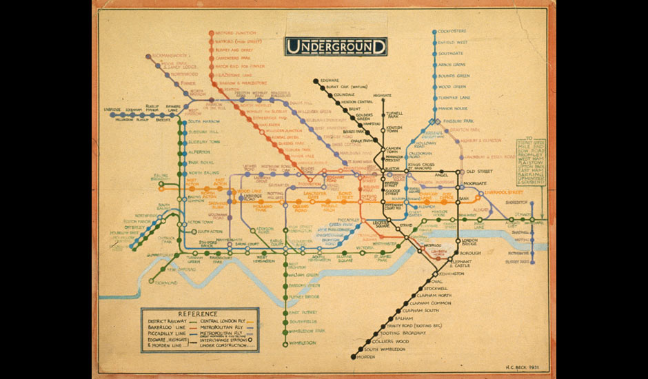
Eureka! Henry Beck's original drawing for the 'diagrammatic' tube map (1931), which sets out routes and stations according to clarity rather than geographical accuracy

8 / 12
A production version of Beck's pocket Underground map, No 1 (1936)

9 / 12
Folded out, the back of Beck's first pocket Underground map

10 / 12
The Great Bear by Simon Patterson (1992). At first glance the work looks like a London tube map, but Patterson subverts the concept of the map by adding his own data to it; in this case, groups of people – from scientists, saints and philosophers to comedians, explorers and footballers

11 / 12
A more familiar sight ... the current London tube map, issued in September 2004

12 / 12
... and its reverse side. Gone are the lists of useful destinations; instead, with so many new stations and routes to cover, there is an index and an explanation of symbols


